Several years ago, I used to frequent a popular birding forum in BC. I was new to wildlife photography and at first had less than ideal equipment. I needed all the help I could get! The forum was valuable for a great variety of information, not least of which was access to some excellent images of BC birds. I learned a lot about birds and even more about quality photography — just by observation. No one was anything but supportive of those who posted (a fact that seems to apply to most photographic sites I visit). Sometimes, however, it was pretty obvious that some posts were of substantially higher quality / value than others.
The basics came quickly — the rule of thirds, issues of exposure and colour balance, clarity, capturing motion in a still, and of course, processing (both over and under)…. Besides these considerations, it was obvious that different folks have different tastes and different tolerances for defects. While I’m inclined to be a perfectionist, I’m a failed one who is often far too tolerant of my own “near misses”….

This piece is a reflection on shots taken recently at Kelowna’s Waterfront Park, a place I visit only a few times each year. Also know as Rotary Marsh, this spot is a 15-minute-drive from home, all of 6–8 km away, depending upon one’s route choice. Sure, I’ll go in early Spring just to see what’s there, or on Canada Day just to be patriotic. But in late October / early November, on a sunny Second Summer late morning, it’s for the light, and the Gadwalls….
Probably one or two photos would have sufficed to show why I like the place. I’ve chosen, however, to post the near misses as well as the ones that come closest to the quality I had in mind when I pressed the shutter button.
Let’s begin with the best of the bunch, then take a look at others and examine why they don’t work as well:
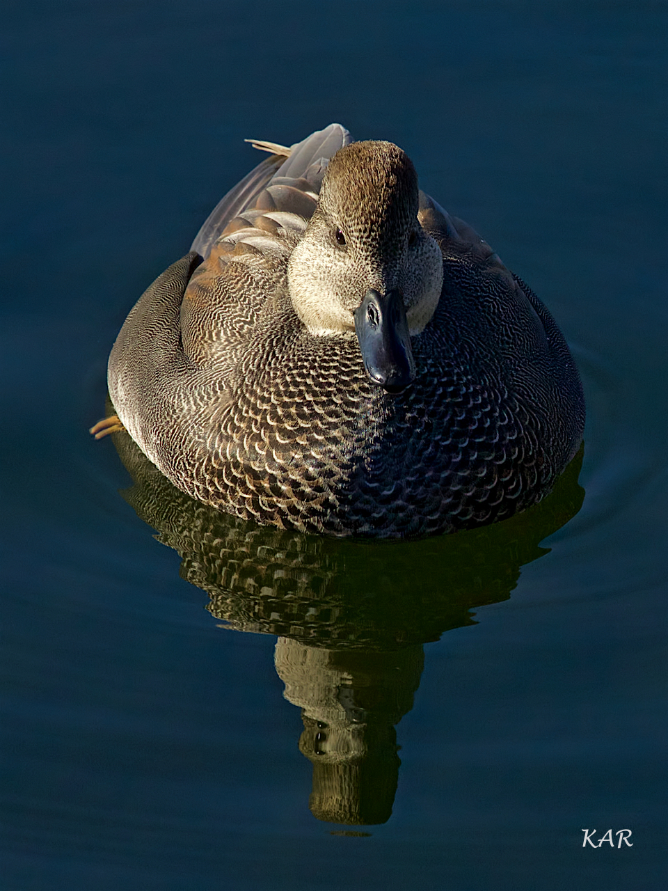
I like the way the bird is centred so that it’s half in light and half in shadow. Even the shaded side, however, offers some detail and trace of light. The reflection on the left tip of the bill is a nice touch. With its saturated tones, we realize that the photographer is aiming for art not merely a record or snapshot. There is effective clarity throughout. The water bokeh is informative but not distracting. Although the duck is not looking directly at the camera, we get a sense that he’s aware of what’s going on.
Contrast the shot above with the next two near (or, perhaps, not so near) misses:
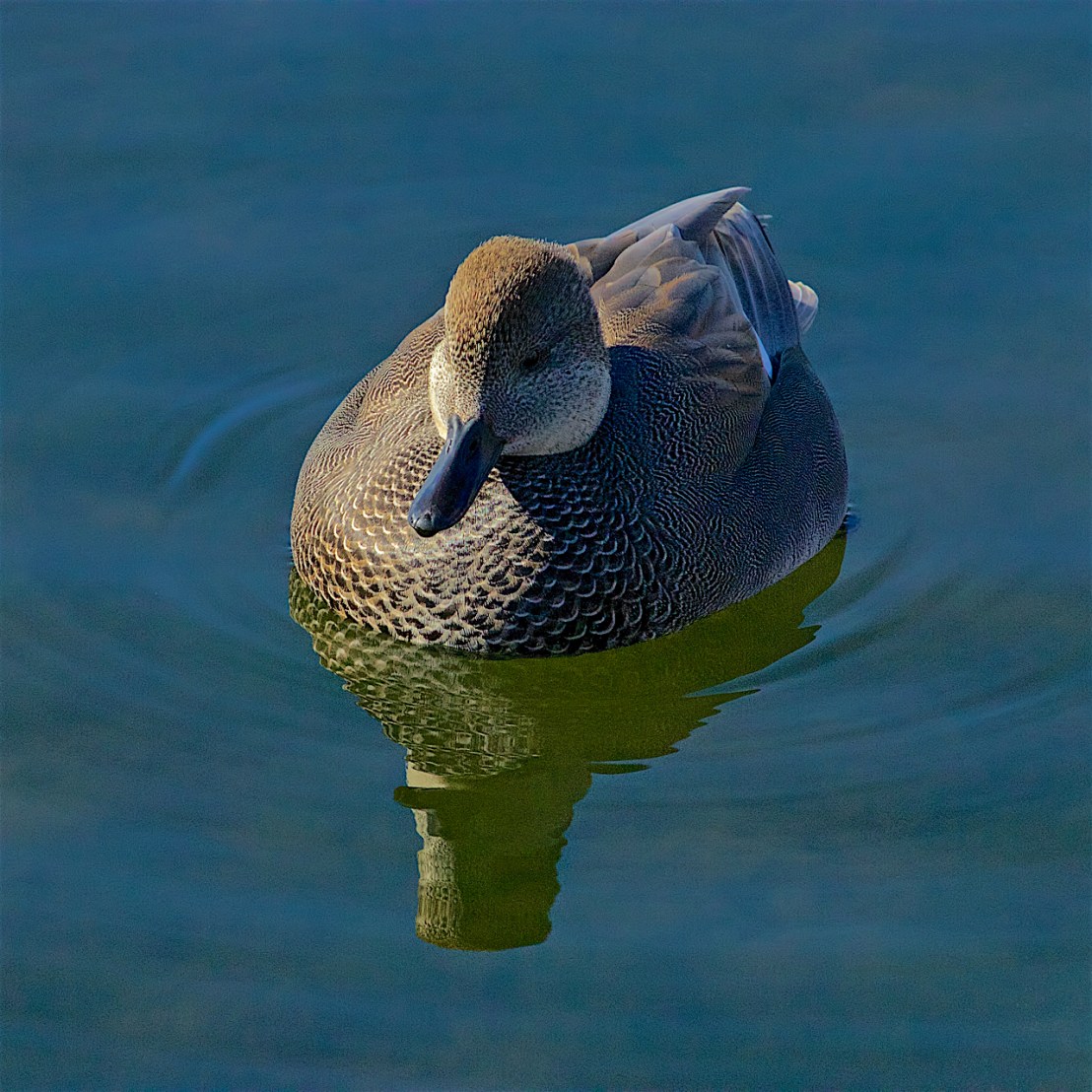

In the shot just above, the distribution of light and shadow, compared with the image we like, is off target, not 50-50. The plumage detail on the sunlit side is beautiful, but, sadly, we’ve got only halfaduck here!
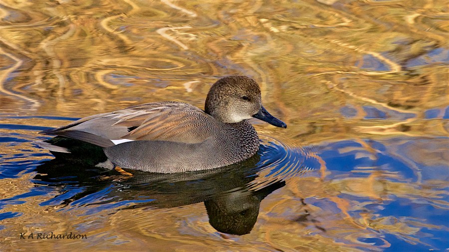
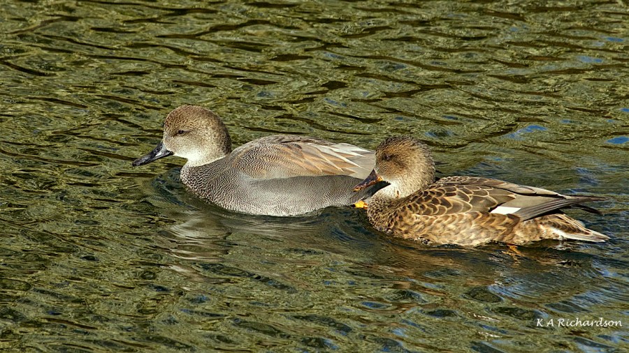
In the set below, viewer preferences will determine” the better shot.” I’ve been quite surprised, sometimes when my peers’ selection of the “quality one” differ from mine.
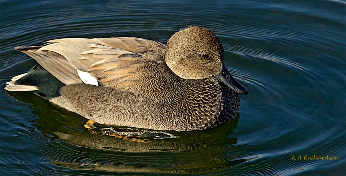

In this set, while both are near misses, in my opinion, each still has some appeal. I like the greater simplicity in the photo on the bottom. I wish the drake didn’t look so sleepy, but that’s a minor consideration for me. The upper photo has an orange tint, the lower one more blue. The water is less distracting in the lower shot. Finally I prefer to see the whole foot rather than its fragmented image.
Yet I have friends who see what I consider defects as positive attributes. Sometimes, it’s simply a case of my being more sensitive to some flaws than others rather than finding certain attributes more resonating than others. Critical vs affirming mental approaches….
One more point about quality and perceptions of it. Since we’re viewing our photographs on monitors, it behooves us to make sure the latter are set for optimal viewing. Back in my consulting days, I saw way too many monitors that needed to be recalibrated — corrected for brightness and colour…. I’m sure that some over-saturated photos I see online were produced on monitors that were too bright, and some diluted-toned images developed on monitors that were too dark….
Finally, two shots below remind us that the photographer is to some degree as much responsible for the way a pond looks as nature is. Change your angle and you’ll change the photo. We all know this, I think, and sometimes, there’s no opportunity to find the optimal shot location — we have to shoot what we’re served. But when we have a choice, make it!
The shots below were taken in the same pond only minutes and metres apart. The outcomes, however, are remarkably different….
So that’s it for the moment. If you’re a young photographer or a neophyte to this genre, I hope you’ve found something worth thinking about. I wish you well. I hope that you will continue to study, explore, and pursue the best results you can come up with!
